Mobile UX · Networking and job discovery
Let'sFAME
Make it easier to decide which film jobs to apply for.
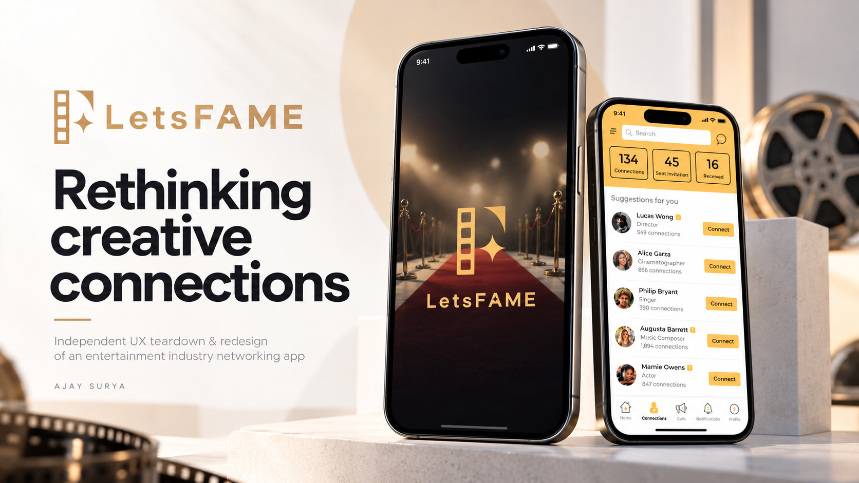
I reviewed how film and entertainment professionals introduce themselves, find work, and apply on Let’sFAME. I proposed changes to the screens that lead up to an application.
The challenge
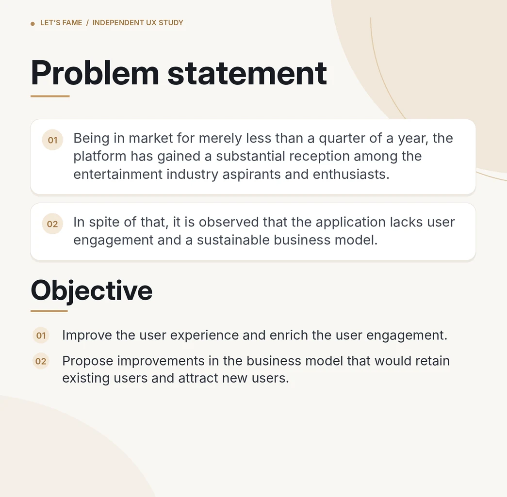
People had to sign up before seeing the introduction. In the feed, search and key actions competed for space. Job listings needed more detail up front so a candidate could tell whether a role fit their skills.
Original product context and analysis
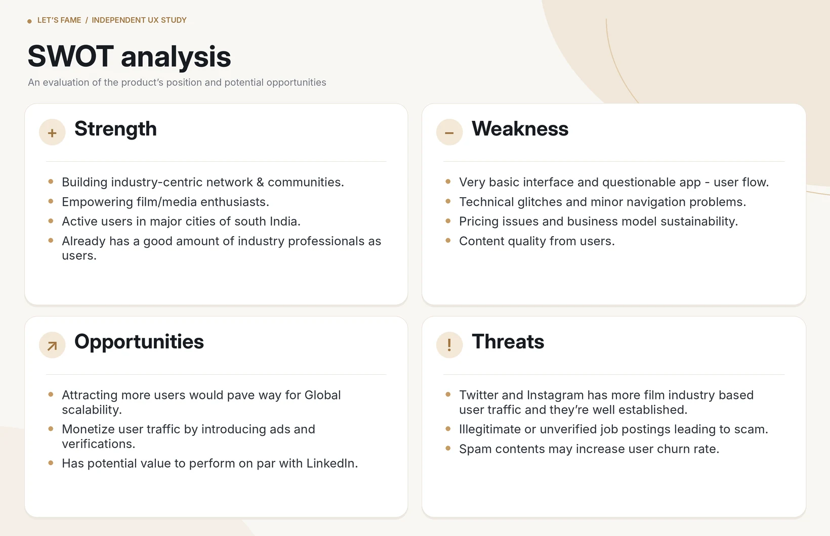
What I reviewed
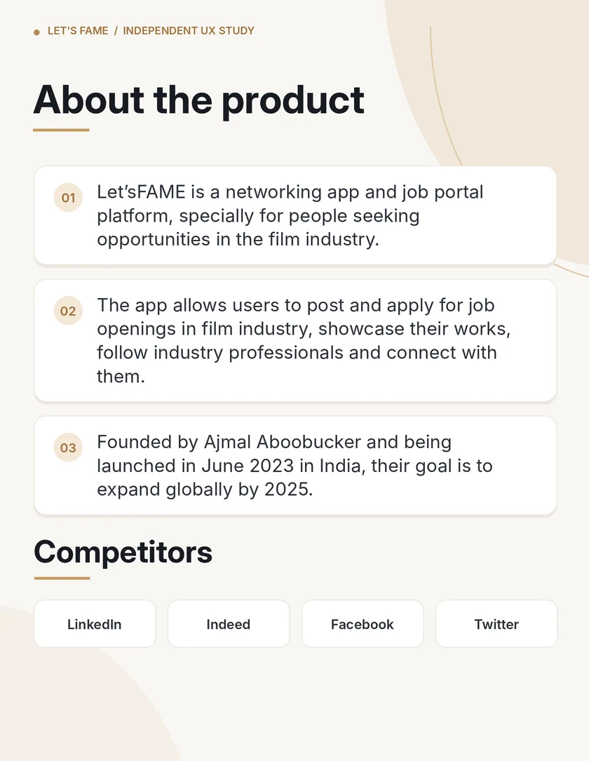
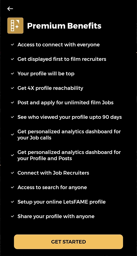
I audited the app and its premium features, compared discovery patterns with LinkedIn and Twitter, and mapped the path from signup to profile setup and job applications. I also gathered informal feedback and ran a survey with about 30 reported responses. The original study includes the survey questions.
Survey, journey maps, and competitive comparison
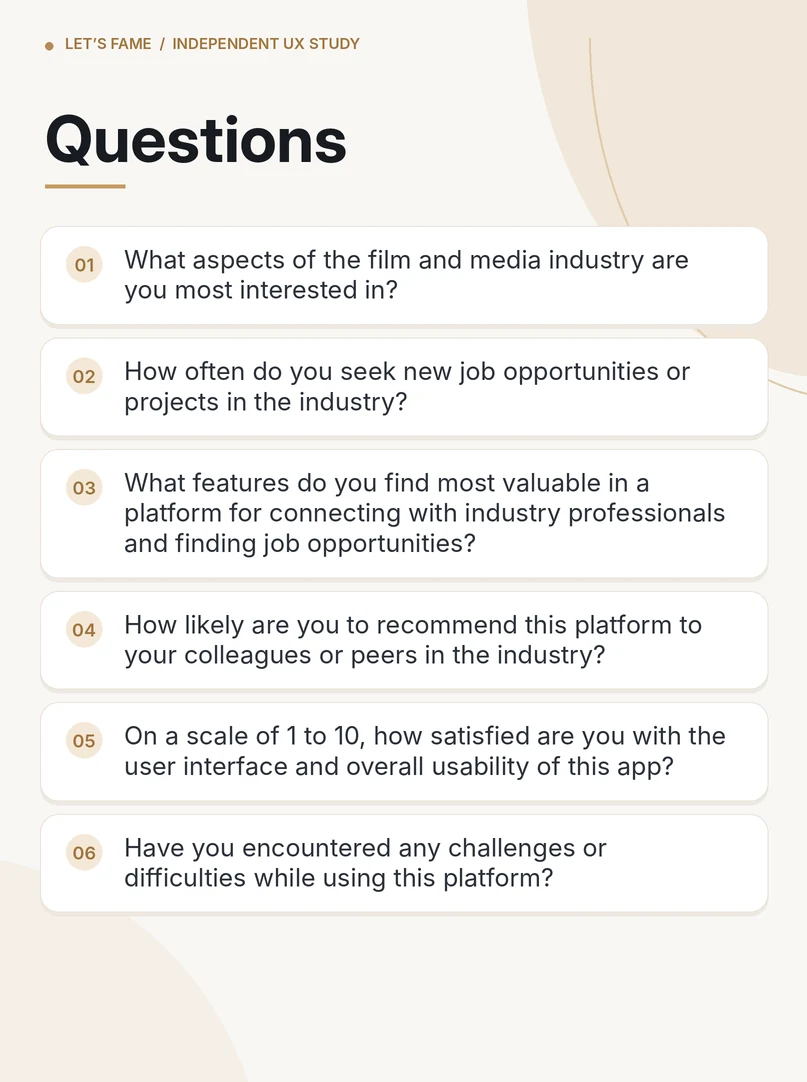
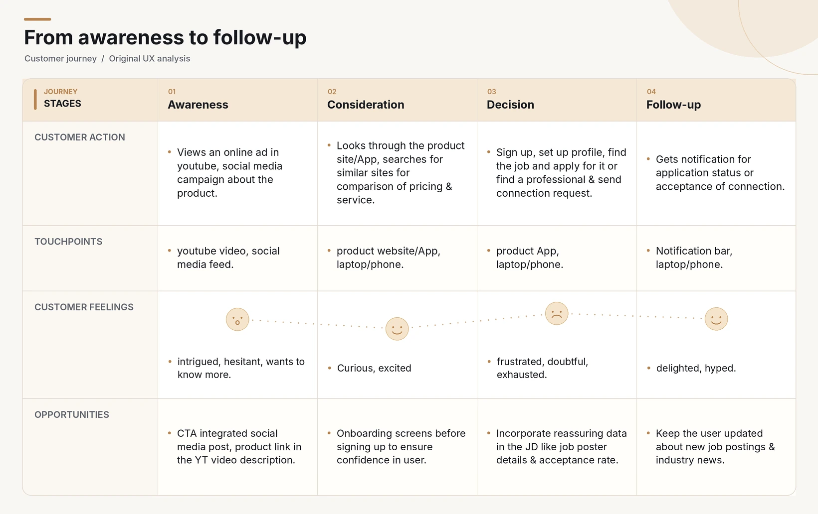
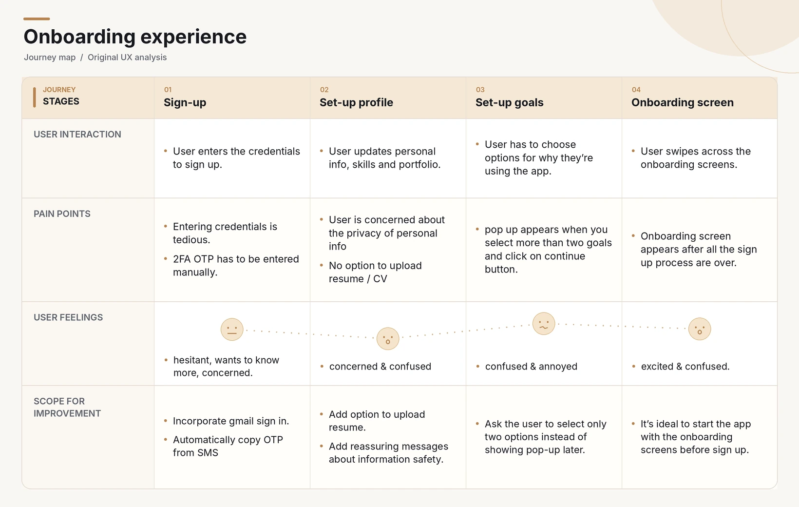
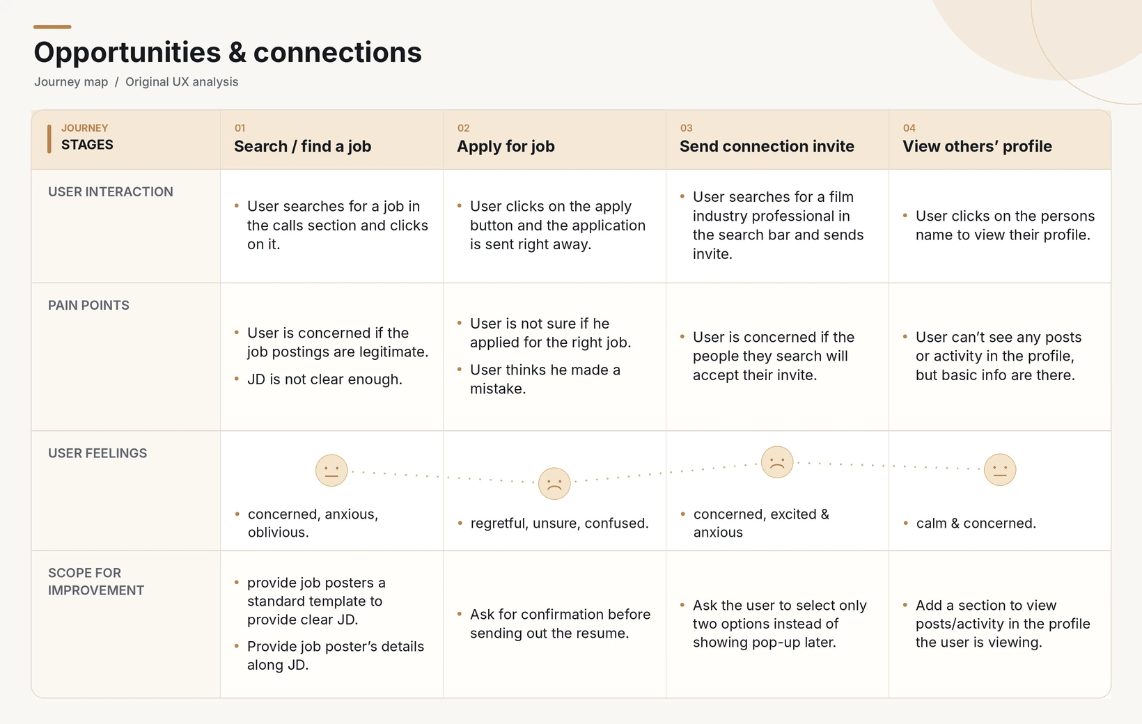
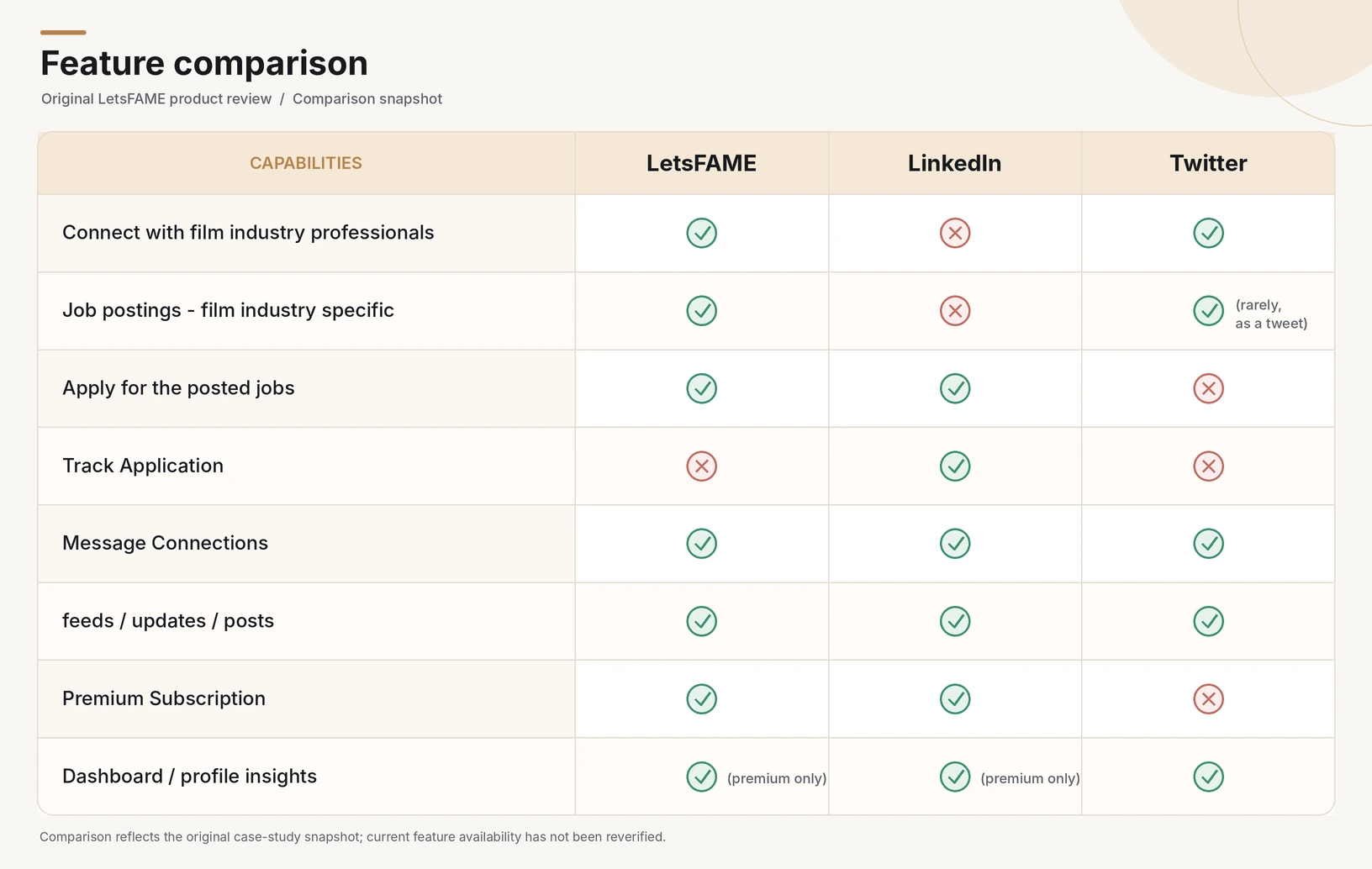
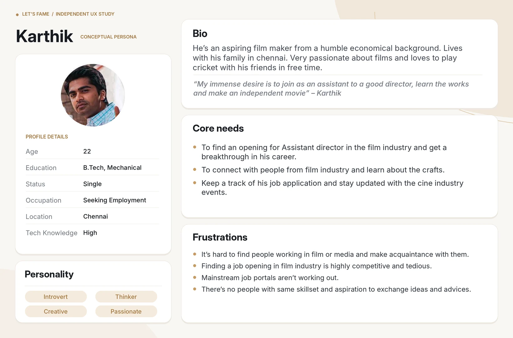
Where people needed more information
Before signup
Explain how networking and finding work fit together before asking someone to register.
In the feed
Give search, navigation, and publishing distinct places.
In a listing
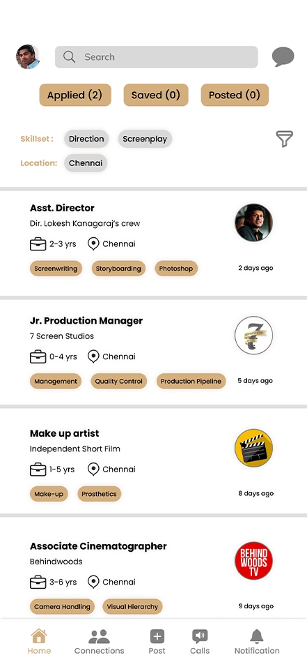
Show the location, experience, and required skills where candidates can compare them.
On a profile
Group portfolio work, credentials, and experience so a connection can see what someone does.
Three design decisions
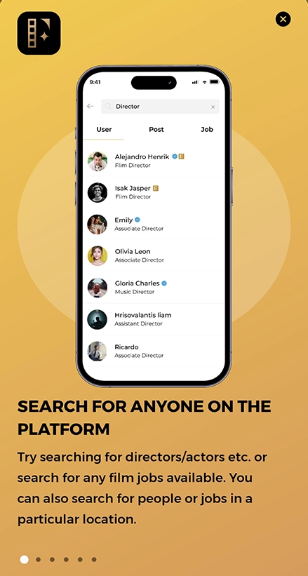
Introduce the product before signup
I moved the introduction out of the signed-in flow. Someone can see what the app is for before deciding to create an account.
Give the feed and profile clearer jobs
I grouped the feed controls and gave navigation a consistent place. I reorganized the professional profile around skills, work samples, and experience so it can support a decision to connect.
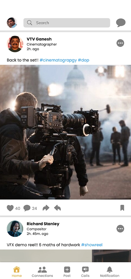
Show what a job asks for before applying
I surfaced filters, location, experience, and required skills in discovery. A separate job-detail page gives candidates more context, and a dedicated form collects their résumé, work experience, and interview availability.
Follow a candidate through the proposal
A candidate can discover people, look at their work, check a role’s requirements, and apply with the information ready.
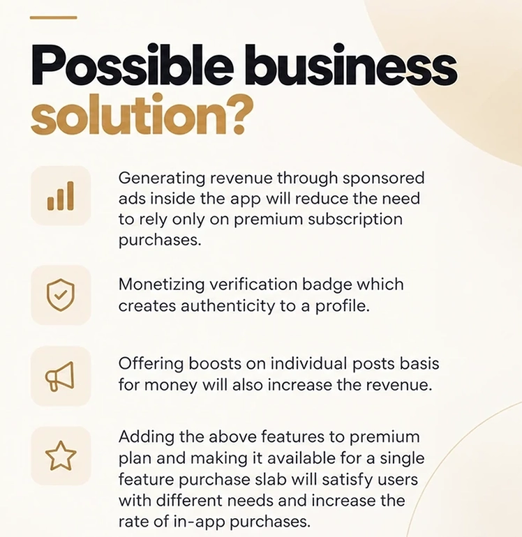
Business hypotheses
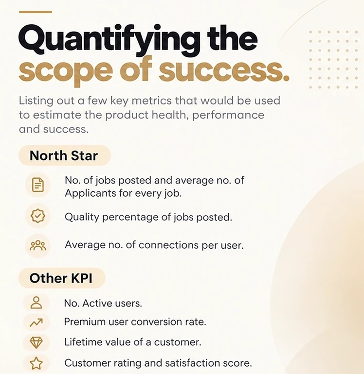
I explored profile verification, promoted job postings, and individual feature purchases. I proposed tracking job-post quality, applications, professional connections, active users, and premium conversion to learn which ideas were worth pursuing.
Original hypotheses and proposed measures
What I would test next
I’d ask people to explain what the app does before signing up, find a listing that matches their skills, and complete an application. I’d watch where they need to go back for information before changing the flow again.